java.lang.Object
javafx.stage.Window
javafx.stage.PopupWindow
javafx.scene.control.PopupControl
javafx.scene.control.Tooltip
- All Implemented Interfaces:
Styleable,EventTarget,Skinnable
Tooltips are common UI elements which are typically used for showing
additional information about a Node in the scenegraph when the Node is
hovered over by the mouse. Any Node can show a tooltip. In most cases a
Tooltip is created and its 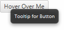
text property is modified
to show plain text to the user. However, a Tooltip is able to show within it
an arbitrary scenegraph of nodes - this is done by creating the scenegraph
and setting it inside the Tooltip graphic
property.
You use the following approach to set a Tooltip on any node:
 Rectangle rect = new Rectangle(0, 0, 100, 100);
 Tooltip t = new Tooltip("A Square");
 Tooltip.install(rect, t);
This tooltip will then participate with the typical tooltip semantics (i.e.
appearing on hover, etc). Note that the Tooltip does not have to be
uninstalled: it will be garbage collected when it is not referenced by any
Node. It is possible to manually uninstall the tooltip, however.
A single tooltip can be installed on multiple target nodes or multiple controls.
Because most Tooltips are shown on UI controls, there is special API for all controls to make installing a Tooltip less verbose. The example below shows how to create a tooltip for a Button control:
 Button button = new Button("Hover Over Me");
 button.setTooltip(new Tooltip("Tooltip for Button"));
- Since:
- JavaFX 2.0
-
Property Summary
PropertiesTypePropertyDescriptionfinal ReadOnlyBooleanPropertyTypically, the tooltip is "activated" when the mouse moves over a Control.final ObjectProperty<ContentDisplay>Specifies the positioning of the graphic relative to the text.final ObjectProperty<Font>The default font to use for text in the Tooltip.final ObjectProperty<Node>An optional icon for the Tooltip.final DoublePropertyThe amount of space between the graphic and textfinal ObjectProperty<Duration>The duration in which to continue showing the tooltip after the mouse has left the node.final ObjectProperty<Duration>The delay between the mouse entering the hovered node and when the associated tooltip will be shown to the user.final ObjectProperty<Duration>The duration that the tooltip should remain showing for until it is no longer visible to the user.final ObjectProperty<TextAlignment>Specifies the behavior for lines of text when text is multiline.final ObjectProperty<OverrunStyle>Specifies the behavior to use if the text of theTooltipexceeds the available space for rendering the text.final StringPropertyThe text to display in the tooltip.final BooleanPropertyIf a run of text exceeds the width of the Tooltip, then this variable indicates whether the text should wrap onto another line.Properties declared in class javafx.scene.control.PopupControl
id, maxHeight, maxWidth, minHeight, minWidth, prefHeight, prefWidth, skin, styleProperties declared in class javafx.stage.PopupWindow
anchorLocation, anchorX, anchorY, autoFix, autoHide, consumeAutoHidingEvents, hideOnEscape, onAutoHide, ownerNode, ownerWindowProperties declared in class javafx.stage.Window
eventDispatcher, focused, forceIntegerRenderScale, height, onCloseRequest, onHidden, onHiding, onShowing, onShown, opacity, outputScaleX, outputScaleY, renderScaleX, renderScaleY, scene, showing, width, x, y -
Nested Class Summary
Nested classes/interfaces declared in class javafx.stage.PopupWindow
PopupWindow.AnchorLocation -
Field Summary
Fields declared in class javafx.scene.control.PopupControl
bridge, USE_COMPUTED_SIZE, USE_PREF_SIZE -
Constructor Summary
Constructors -
Method Summary
Modifier and TypeMethodDescriptionfinal ReadOnlyBooleanPropertyTypically, the tooltip is "activated" when the mouse moves over a Control.final ObjectProperty<ContentDisplay>Specifies the positioning of the graphic relative to the text.final ObjectProperty<Font>The default font to use for text in the Tooltip.static List<CssMetaData<? extends Styleable,?>> Gets theCssMetaDataassociated with this class, which may include theCssMetaDataof its superclasses.final ContentDisplayGets the value of thecontentDisplayproperty.List<CssMetaData<? extends Styleable,?>> The CssMetaData of this Styleable.final FontgetFont()Gets the value of thefontproperty.final NodeGets the value of thegraphicproperty.final doubleGets the value of thegraphicTextGapproperty.final DurationGets the value of thehideDelayproperty.final DurationGets the value of theshowDelayproperty.final DurationGets the value of theshowDurationproperty.final StringgetText()Gets the value of thetextproperty.final TextAlignmentGets the value of thetextAlignmentproperty.final OverrunStyleGets the value of thetextOverrunproperty.final ObjectProperty<Node>An optional icon for the Tooltip.final DoublePropertyThe amount of space between the graphic and textfinal ObjectProperty<Duration>The duration in which to continue showing the tooltip after the mouse has left the node.static voidfinal booleanGets the value of theactivatedproperty.final booleanGets the value of thewrapTextproperty.final voidsetContentDisplay(ContentDisplay value) Sets the value of thecontentDisplayproperty.final voidSets the value of thefontproperty.final voidsetGraphic(Node value) Sets the value of thegraphicproperty.final voidsetGraphicTextGap(double value) Sets the value of thegraphicTextGapproperty.final voidsetHideDelay(Duration hideDelay) Sets the value of thehideDelayproperty.final voidsetShowDelay(Duration showDelay) Sets the value of theshowDelayproperty.final voidsetShowDuration(Duration showDuration) Sets the value of theshowDurationproperty.final voidSets the value of thetextproperty.final voidsetTextAlignment(TextAlignment value) Sets the value of thetextAlignmentproperty.final voidsetTextOverrun(OverrunStyle value) Sets the value of thetextOverrunproperty.final voidsetWrapText(boolean value) Sets the value of thewrapTextproperty.final ObjectProperty<Duration>The delay between the mouse entering the hovered node and when the associated tooltip will be shown to the user.final ObjectProperty<Duration>The duration that the tooltip should remain showing for until it is no longer visible to the user.final ObjectProperty<TextAlignment>Specifies the behavior for lines of text when text is multiline.final ObjectProperty<OverrunStyle>Specifies the behavior to use if the text of theTooltipexceeds the available space for rendering the text.final StringPropertyThe text to display in the tooltip.static voidfinal BooleanPropertyIf a run of text exceeds the width of the Tooltip, then this variable indicates whether the text should wrap onto another line.Methods declared in class javafx.scene.control.PopupControl
createDefaultSkin, getId, getMaxHeight, getMaxWidth, getMinHeight, getMinWidth, getPrefHeight, getPrefWidth, getPseudoClassStates, getSkin, getStyle, getStyleableParent, getStyleClass, getTypeSelector, idProperty, maxHeight, maxHeightProperty, maxWidth, maxWidthProperty, minHeight, minHeightProperty, minWidth, minWidthProperty, prefHeight, prefHeightProperty, prefWidth, prefWidthProperty, pseudoClassStateChanged, setId, setMaxHeight, setMaxSize, setMaxWidth, setMinHeight, setMinSize, setMinWidth, setPrefHeight, setPrefSize, setPrefWidth, setSkin, setStyle, skinProperty, stylePropertyMethods declared in class javafx.stage.PopupWindow
anchorLocationProperty, anchorXProperty, anchorYProperty, autoFixProperty, autoHideProperty, consumeAutoHidingEventsProperty, getAnchorLocation, getAnchorX, getAnchorY, getConsumeAutoHidingEvents, getOnAutoHide, getOwnerNode, getOwnerWindow, hide, hideOnEscapeProperty, isAutoFix, isAutoHide, isHideOnEscape, onAutoHideProperty, ownerNodeProperty, ownerWindowProperty, setAnchorLocation, setAnchorX, setAnchorY, setAutoFix, setAutoHide, setConsumeAutoHidingEvents, setHideOnEscape, setOnAutoHide, setScene, show, show, showMethods declared in class javafx.stage.Window
addEventFilter, addEventHandler, buildEventDispatchChain, centerOnScreen, eventDispatcherProperty, fireEvent, focusedProperty, forceIntegerRenderScaleProperty, getEventDispatcher, getHeight, getOnCloseRequest, getOnHidden, getOnHiding, getOnShowing, getOnShown, getOpacity, getOutputScaleX, getOutputScaleY, getProperties, getRenderScaleX, getRenderScaleY, getScene, getUserData, getWidth, getWindows, getX, getY, hasProperties, heightProperty, isFocused, isForceIntegerRenderScale, isShowing, onCloseRequestProperty, onHiddenProperty, onHidingProperty, onShowingProperty, onShownProperty, opacityProperty, outputScaleXProperty, outputScaleYProperty, removeEventFilter, removeEventHandler, renderScaleXProperty, renderScaleYProperty, requestFocus, sceneProperty, setEventDispatcher, setEventHandler, setForceIntegerRenderScale, setHeight, setOnCloseRequest, setOnHidden, setOnHiding, setOnShowing, setOnShown, setOpacity, setRenderScaleX, setRenderScaleY, setUserData, setWidth, setX, setY, show, showingProperty, sizeToScene, widthProperty, xProperty, yPropertyMethods declared in class java.lang.Object
clone, equals, finalize, getClass, hashCode, notify, notifyAll, toString, wait, wait, waitMethods declared in interface javafx.css.Styleable
getStyleableNode
-
Property Details
-
text
The text to display in the tooltip. If the text is set to null, an empty string will be displayed, despite the value being null.- See Also:
-
textAlignment
Specifies the behavior for lines of text when text is multiline. UnlikecontentDisplaywhich affects the graphic and text, this setting only affects multiple lines of text relative to the text bounds. -
textOverrun
Specifies the behavior to use if the text of theTooltipexceeds the available space for rendering the text. -
wrapText
If a run of text exceeds the width of the Tooltip, then this variable indicates whether the text should wrap onto another line. -
font
The default font to use for text in the Tooltip. If the Tooltip's text is rich text then this font may or may not be used depending on the font information embedded in the rich text, but in any case where a default font is required, this font will be used.- See Also:
-
showDelay
The delay between the mouse entering the hovered node and when the associated tooltip will be shown to the user. The default delay is 1000ms.- Default value:
- 1000ms
- Since:
- 9
- See Also:
-
showDuration
The duration that the tooltip should remain showing for until it is no longer visible to the user. If the mouse leaves the control before the showDuration finishes, then the tooltip will remain showing for the duration specified in thehideDelayProperty(), even if the remaining time of the showDuration is less than the hideDelay duration. The default value is 5000ms.- Default value:
- 5000ms
- Since:
- 9
- See Also:
-
hideDelay
The duration in which to continue showing the tooltip after the mouse has left the node. Once this time has elapsed the tooltip will hide. The default value is 200ms.- Default value:
- 200ms
- Since:
- 9
- See Also:
-
graphic
An optional icon for the Tooltip. This can be positioned relative to the text by using thecontent displayproperty. The node specified for this variable cannot appear elsewhere in the scene graph, otherwise theIllegalArgumentExceptionis thrown. See the class description ofNodefor more detail.- See Also:
-
contentDisplay
Specifies the positioning of the graphic relative to the text. -
graphicTextGap
The amount of space between the graphic and text -
activated
Typically, the tooltip is "activated" when the mouse moves over a Control. There is usually some delay between when the Tooltip becomes "activated" and when it is actually shown. The details (such as the amount of delay, etc) is left to the Skin implementation.- See Also:
-
-
Constructor Details
-
Tooltip
public Tooltip()Creates a tooltip with an empty string for its text. -
Tooltip
Creates a tooltip with the specified text.- Parameters:
text- A text string for the tooltip.
-
-
Method Details
-
install
Associates the givenTooltipwith the givenNode. The tooltip can then behave similar to when it is set on anyControl. A single tooltip can be associated with multiple nodes.- Parameters:
node- the nodet- the tooltip- See Also:
-
uninstall
Removes the association of the givenTooltipon the specifiedNode. Hence hovering on the node will no longer result in showing of the tooltip.- Parameters:
node- the nodet- the tooltip- See Also:
-
textProperty
The text to display in the tooltip. If the text is set to null, an empty string will be displayed, despite the value being null.- Returns:
- the text property
- See Also:
-
setText
Sets the value of thetextproperty.- Property description:
- The text to display in the tooltip. If the text is set to null, an empty string will be displayed, despite the value being null.
- Parameters:
value- the value for thetextproperty- See Also:
-
getText
Gets the value of thetextproperty.- Property description:
- The text to display in the tooltip. If the text is set to null, an empty string will be displayed, despite the value being null.
- Returns:
- the value of the
textproperty - See Also:
-
textAlignmentProperty
Specifies the behavior for lines of text when text is multiline. UnlikecontentDisplaywhich affects the graphic and text, this setting only affects multiple lines of text relative to the text bounds.- Returns:
- the text alignment property
- See Also:
-
setTextAlignment
Sets the value of thetextAlignmentproperty.- Property description:
- Specifies the behavior for lines of text when text is multiline.
Unlike
contentDisplaywhich affects the graphic and text, this setting only affects multiple lines of text relative to the text bounds. - Parameters:
value- the value for thetextAlignmentproperty- See Also:
-
getTextAlignment
Gets the value of thetextAlignmentproperty.- Property description:
- Specifies the behavior for lines of text when text is multiline.
Unlike
contentDisplaywhich affects the graphic and text, this setting only affects multiple lines of text relative to the text bounds. - Returns:
- the value of the
textAlignmentproperty - See Also:
-
textOverrunProperty
Specifies the behavior to use if the text of theTooltipexceeds the available space for rendering the text.- Returns:
- the text overrun property
- See Also:
-
setTextOverrun
Sets the value of thetextOverrunproperty.- Property description:
- Specifies the behavior to use if the text of the
Tooltipexceeds the available space for rendering the text. - Parameters:
value- the value for thetextOverrunproperty- See Also:
-
getTextOverrun
Gets the value of thetextOverrunproperty.- Property description:
- Specifies the behavior to use if the text of the
Tooltipexceeds the available space for rendering the text. - Returns:
- the value of the
textOverrunproperty - See Also:
-
wrapTextProperty
If a run of text exceeds the width of the Tooltip, then this variable indicates whether the text should wrap onto another line.- Returns:
- the wrap text property
- See Also:
-
setWrapText
public final void setWrapText(boolean value) Sets the value of thewrapTextproperty.- Property description:
- If a run of text exceeds the width of the Tooltip, then this variable indicates whether the text should wrap onto another line.
- Parameters:
value- the value for thewrapTextproperty- See Also:
-
isWrapText
public final boolean isWrapText()Gets the value of thewrapTextproperty.- Property description:
- If a run of text exceeds the width of the Tooltip, then this variable indicates whether the text should wrap onto another line.
- Returns:
- the value of the
wrapTextproperty - See Also:
-
fontProperty
The default font to use for text in the Tooltip. If the Tooltip's text is rich text then this font may or may not be used depending on the font information embedded in the rich text, but in any case where a default font is required, this font will be used.- Returns:
- the font property
- See Also:
-
setFont
Sets the value of thefontproperty.- Property description:
- The default font to use for text in the Tooltip. If the Tooltip's text is rich text then this font may or may not be used depending on the font information embedded in the rich text, but in any case where a default font is required, this font will be used.
- Parameters:
value- the value for thefontproperty- See Also:
-
getFont
Gets the value of thefontproperty.- Property description:
- The default font to use for text in the Tooltip. If the Tooltip's text is rich text then this font may or may not be used depending on the font information embedded in the rich text, but in any case where a default font is required, this font will be used.
- Returns:
- the value of the
fontproperty - See Also:
-
showDelayProperty
The delay between the mouse entering the hovered node and when the associated tooltip will be shown to the user. The default delay is 1000ms.- Default value:
- 1000ms
- Returns:
- show delay property
- Since:
- 9
- See Also:
-
setShowDelay
Sets the value of theshowDelayproperty.- Property description:
- The delay between the mouse entering the hovered node and when the associated tooltip will be shown to the user. The default delay is 1000ms.
- Default value:
- 1000ms
- Parameters:
showDelay- the value for theshowDelayproperty- Since:
- 9
- See Also:
-
getShowDelay
Gets the value of theshowDelayproperty.- Property description:
- The delay between the mouse entering the hovered node and when the associated tooltip will be shown to the user. The default delay is 1000ms.
- Default value:
- 1000ms
- Returns:
- the value of the
showDelayproperty - Since:
- 9
- See Also:
-
showDurationProperty
The duration that the tooltip should remain showing for until it is no longer visible to the user. If the mouse leaves the control before the showDuration finishes, then the tooltip will remain showing for the duration specified in thehideDelayProperty(), even if the remaining time of the showDuration is less than the hideDelay duration. The default value is 5000ms.- Default value:
- 5000ms
- Returns:
- the show duration property
- Since:
- 9
- See Also:
-
setShowDuration
Sets the value of theshowDurationproperty.- Property description:
- The duration that the tooltip should remain showing for until it is no longer visible to the user.
If the mouse leaves the control before the showDuration finishes, then the tooltip will remain showing
for the duration specified in the
hideDelayProperty(), even if the remaining time of the showDuration is less than the hideDelay duration. The default value is 5000ms. - Default value:
- 5000ms
- Parameters:
showDuration- the value for theshowDurationproperty- Since:
- 9
- See Also:
-
getShowDuration
Gets the value of theshowDurationproperty.- Property description:
- The duration that the tooltip should remain showing for until it is no longer visible to the user.
If the mouse leaves the control before the showDuration finishes, then the tooltip will remain showing
for the duration specified in the
hideDelayProperty(), even if the remaining time of the showDuration is less than the hideDelay duration. The default value is 5000ms. - Default value:
- 5000ms
- Returns:
- the value of the
showDurationproperty - Since:
- 9
- See Also:
-
hideDelayProperty
The duration in which to continue showing the tooltip after the mouse has left the node. Once this time has elapsed the tooltip will hide. The default value is 200ms.- Default value:
- 200ms
- Returns:
- the hide delay property
- Since:
- 9
- See Also:
-
setHideDelay
Sets the value of thehideDelayproperty.- Property description:
- The duration in which to continue showing the tooltip after the mouse has left the node. Once this time has elapsed the tooltip will hide. The default value is 200ms.
- Default value:
- 200ms
- Parameters:
hideDelay- the value for thehideDelayproperty- Since:
- 9
- See Also:
-
getHideDelay
Gets the value of thehideDelayproperty.- Property description:
- The duration in which to continue showing the tooltip after the mouse has left the node. Once this time has elapsed the tooltip will hide. The default value is 200ms.
- Default value:
- 200ms
- Returns:
- the value of the
hideDelayproperty - Since:
- 9
- See Also:
-
graphicProperty
An optional icon for the Tooltip. This can be positioned relative to the text by using thecontent displayproperty. The node specified for this variable cannot appear elsewhere in the scene graph, otherwise theIllegalArgumentExceptionis thrown. See the class description ofNodefor more detail.- Returns:
- the graphic property
- See Also:
-
setGraphic
Sets the value of thegraphicproperty.- Property description:
- An optional icon for the Tooltip. This can be positioned relative to the
text by using the
content displayproperty. The node specified for this variable cannot appear elsewhere in the scene graph, otherwise theIllegalArgumentExceptionis thrown. See the class description ofNodefor more detail. - Parameters:
value- the value for thegraphicproperty- See Also:
-
getGraphic
Gets the value of thegraphicproperty.- Property description:
- An optional icon for the Tooltip. This can be positioned relative to the
text by using the
content displayproperty. The node specified for this variable cannot appear elsewhere in the scene graph, otherwise theIllegalArgumentExceptionis thrown. See the class description ofNodefor more detail. - Returns:
- the value of the
graphicproperty - See Also:
-
contentDisplayProperty
Specifies the positioning of the graphic relative to the text.- Returns:
- the content display property
- See Also:
-
setContentDisplay
Sets the value of thecontentDisplayproperty.- Property description:
- Specifies the positioning of the graphic relative to the text.
- Parameters:
value- the value for thecontentDisplayproperty- See Also:
-
getContentDisplay
Gets the value of thecontentDisplayproperty.- Property description:
- Specifies the positioning of the graphic relative to the text.
- Returns:
- the value of the
contentDisplayproperty - See Also:
-
graphicTextGapProperty
The amount of space between the graphic and text- Returns:
- the graphic text gap property
- See Also:
-
setGraphicTextGap
public final void setGraphicTextGap(double value) Sets the value of thegraphicTextGapproperty.- Property description:
- The amount of space between the graphic and text
- Parameters:
value- the value for thegraphicTextGapproperty- See Also:
-
getGraphicTextGap
public final double getGraphicTextGap()Gets the value of thegraphicTextGapproperty.- Property description:
- The amount of space between the graphic and text
- Returns:
- the value of the
graphicTextGapproperty - See Also:
-
isActivated
public final boolean isActivated()Gets the value of theactivatedproperty.- Property description:
- Typically, the tooltip is "activated" when the mouse moves over a Control. There is usually some delay between when the Tooltip becomes "activated" and when it is actually shown. The details (such as the amount of delay, etc) is left to the Skin implementation.
- Returns:
- the value of the
activatedproperty - See Also:
-
activatedProperty
Typically, the tooltip is "activated" when the mouse moves over a Control. There is usually some delay between when the Tooltip becomes "activated" and when it is actually shown. The details (such as the amount of delay, etc) is left to the Skin implementation.- Returns:
- the
activatedproperty - See Also:
-
getClassCssMetaData
Gets theCssMetaDataassociated with this class, which may include theCssMetaDataof its superclasses.- Returns:
- the
CssMetaData - Since:
- JavaFX 8.0
-
getCssMetaData
The CssMetaData of this Styleable. This may be returned as an unmodifiable list.- Specified by:
getCssMetaDatain interfaceStyleable- Overrides:
getCssMetaDatain classPopupControl- Returns:
- the CssMetaData
- Since:
- JavaFX 8.0
-