- Type Parameters:
T- The type of the value that has been selected or otherwise entered in to this ComboBox
- All Implemented Interfaces:
Styleable,EventTarget,Skinnable
ComboBoxBase abstract class for the most common
form of ComboBox, where a popup list is shown to users providing them with
a choice that they may select from. For more information around the general
concepts and API of ComboBox, refer to the ComboBoxBase class
documentation.
On top of ComboBoxBase, the ComboBox class introduces additional API. Most
importantly, it adds an items property that works in
much the same way as the ListView items
property. In other words, it is the content of the items list that is displayed
to users when they click on the ComboBox button.
The ComboBox exposes the ComboBoxBase.valueProperty() from
ComboBoxBase, but there are some important points
of the value property that need to be understood in relation to ComboBox.
These include:
- The value property is not constrained to items contained within the items list - it can be anything as long as it is a valid value of type T.
- If the value property is set to a non-null object, and subsequently the items list is cleared, the value property is not nulled out.
- Clearing the
selectionin the selection model does not null the value property - it remains the same as before. - It is valid for the selection model to have a selection set to a given
index even if there is no items in the list (or less items in the list than
the given index). Once the items list is further populated, such that the
list contains enough items to have an item in the given index, both the
selection model
SelectionModel.selectedItemProperty()and value property will be updated to have this value. This is inconsistent with other controls that use a selection model, but done intentionally for ComboBox.
By default, when the popup list is showing, the maximum number of rows
visible is 10, but this can be changed by modifying the
visibleRowCount property. If the number of
items in the ComboBox is less than the value of visibleRowCount,
then the items size will be used instead so that the popup list is not
exceedingly long.
As with ListView, it is possible to modify the
selection model that is used,
although this is likely to be rarely changed. This is because the ComboBox
enforces the need for a SingleSelectionModel
instance, and it is not likely that there is much need for alternate
implementations. Nonetheless, the option is there should use cases be found
for switching the selection model.
As the ComboBox internally renders content with a ListView, API exists in
the ComboBox class to allow for a custom cell factory to be set. For more
information on cell factories, refer to the Cell and ListCell
classes. It is important to note that if a cell factory is set on a ComboBox,
cells will only be used in the ListView that shows when the ComboBox is
clicked. If you also want to customize the rendering of the 'button' area
of the ComboBox, you can set a custom ListCell instance in the
button cell property. One way of doing this
is with the following code (note the use of setButtonCell:
 Callback<ListView<String>, ListCell<String>> cellFactory = ...;
 ComboBox comboBox = new ComboBox();
 comboBox.setItems(items);
 comboBox.setButtonCell(cellFactory.call(null));
 comboBox.setCellFactory(cellFactory);
Because a ComboBox can be editable, and the
default means of allowing user input is via a TextField, a
string converter property is provided to allow
for developers to specify how to translate a users string into an object of
type T, such that the value property may contain it.
By default the converter simply returns the String input as the user typed it,
which therefore assumes that the type of the editable ComboBox is String. If
a different type is specified and the ComboBox is to be editable, it is
necessary to specify a custom StringConverter.
Warning: Nodes should not be inserted directly into the ComboBox items list
ComboBox allows for the items list to contain elements of any type, including
Node instances. Putting nodes into
the items list is strongly discouraged, as it can
lead to unexpected results. This is because
the default cell factory simply inserts Node
items directly into the cell, including in the ComboBox 'button' area too.
Because the scenegraph only allows for Nodes to be in one place at a time,
this means that when an item is selected it becomes removed from the ComboBox
list, and becomes visible in the button area. When selection changes the
previously selected item returns to the list and the new selection is removed.
Important points to note:
- Avoid inserting
Nodeinstances directly into theComboBoxitems list or its data model. - The recommended approach is to put the relevant information into the items list, and
provide a custom
cell factoryto create the nodes for a given cell and update them on demand using the data stored in the item for that cell. - Avoid creating new
Nodes in theupdateItemmethod of a customcell factory.
The following minimal example shows how to create a custom cell factory for ComboBox containing Nodes:
 ComboBox<Color> cmb = new ComboBox<>();
 cmb.getItems().addAll(
     Color.RED,
     Color.GREEN,
     Color.BLUE);

 cmb.setCellFactory(p -> {
     return new ListCell<>() {
         private final Rectangle rectangle;
         {
             setContentDisplay(ContentDisplay.GRAPHIC_ONLY);
             rectangle = new Rectangle(10, 10);
         }

         @Override protected void updateItem(Color item, boolean empty) {
             super.updateItem(item, empty);

             if (item == null || empty) {
                 setGraphic(null);
             } else {
                 rectangle.setFill(item);
                 setGraphic(rectangle);
             }
         }
     };
 });
This example has an anonymous custom ListCell class in the custom cell factory.
Note that the Rectangle (Node) object needs to be created in the instance initialization block
or the constructor of the custom ListCell class and updated/used in its updateItem method.
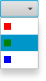
Admittedly the above approach is far more verbose, but it offers the required functionality without encountering the scenegraph constraints.
- Since:
- JavaFX 2.1
- See Also:
-
Property Summary
PropertiesTypePropertyDescriptionThe button cell is used to render what is shown in the ComboBox 'button' area.Providing a custom cell factory allows for complete customization of the rendering of items in the ComboBox.final ReadOnlyObjectProperty<TextField>The editor for the ComboBox.The list of items to show within the ComboBox popup.final ObjectProperty<Node>This Node is shown to the user when the ComboBox has no content to show.final ObjectProperty<SingleSelectionModel<T>>The selection model for the ComboBox.final IntegerPropertyThe maximum number of rows to be visible in the ComboBox popup when it is showing.Properties declared in class javafx.scene.control.ComboBoxBase
armed, editable, onAction, onHidden, onHiding, onShowing, onShown, promptText, showing, valueProperties declared in class javafx.scene.control.Control
contextMenu, skin, tooltipProperties declared in class javafx.scene.layout.Region
background, border, cacheShape, centerShape, height, insets, maxHeight, maxWidth, minHeight, minWidth, opaqueInsets, padding, prefHeight, prefWidth, scaleShape, shape, snapToPixel, widthProperties declared in class javafx.scene.Parent
needsLayoutProperties declared in class javafx.scene.Node
accessibleHelp, accessibleRoleDescription, accessibleRole, accessibleText, blendMode, boundsInLocal, boundsInParent, cacheHint, cache, clip, cursor, depthTest, disabled, disable, effectiveNodeOrientation, effect, eventDispatcher, focused, focusTraversable, focusVisible, focusWithin, hover, id, inputMethodRequests, layoutBounds, layoutX, layoutY, localToParentTransform, localToSceneTransform, managed, mouseTransparent, nodeOrientation, onContextMenuRequested, onDragDetected, onDragDone, onDragDropped, onDragEntered, onDragExited, onDragOver, onInputMethodTextChanged, onKeyPressed, onKeyReleased, onKeyTyped, onMouseClicked, onMouseDragEntered, onMouseDragExited, onMouseDragged, onMouseDragOver, onMouseDragReleased, onMouseEntered, onMouseExited, onMouseMoved, onMousePressed, onMouseReleased, onRotate, onRotationFinished, onRotationStarted, onScrollFinished, onScroll, onScrollStarted, onSwipeDown, onSwipeLeft, onSwipeRight, onSwipeUp, onTouchMoved, onTouchPressed, onTouchReleased, onTouchStationary, onZoomFinished, onZoom, onZoomStarted, opacity, parent, pickOnBounds, pressed, rotate, rotationAxis, scaleX, scaleY, scaleZ, scene, style, translateX, translateY, translateZ, viewOrder, visible -
Field Summary
Fields declared in class javafx.scene.control.ComboBoxBase
ON_HIDDEN, ON_HIDING, ON_SHOWING, ON_SHOWNFields declared in class javafx.scene.layout.Region
USE_COMPUTED_SIZE, USE_PREF_SIZEFields declared in class javafx.scene.Node
BASELINE_OFFSET_SAME_AS_HEIGHT -
Constructor Summary
ConstructorsConstructorDescriptionComboBox()Creates a default ComboBox instance with an emptyitemslist and defaultselection model.ComboBox(ObservableList<T> items) Creates a default ComboBox instance with the provided items list and a defaultselection model. -
Method Summary
Modifier and TypeMethodDescriptionThe button cell is used to render what is shown in the ComboBox 'button' area.final voidProviding a custom cell factory allows for complete customization of the rendering of items in the ComboBox.final voidfinal ReadOnlyObjectProperty<TextField>The editor for the ComboBox.Gets the value of thebuttonCellproperty.Gets the value of thecellFactoryproperty.final StringConverter<T>Gets the value of theconverterproperty.final TextFieldGets the value of theeditorproperty.final ObservableList<T>getItems()Gets the value of theitemsproperty.final NodeGets the value of theplaceholderproperty.final SingleSelectionModel<T>Gets the value of theselectionModelproperty.final intGets the value of thevisibleRowCountproperty.The list of items to show within the ComboBox popup.final ObjectProperty<Node>This Node is shown to the user when the ComboBox has no content to show.final ObjectProperty<SingleSelectionModel<T>>The selection model for the ComboBox.final voidsetButtonCell(ListCell<T> value) Sets the value of thebuttonCellproperty.final voidSets the value of thecellFactoryproperty.final voidsetConverter(StringConverter<T> value) Sets the value of theconverterproperty.final voidsetItems(ObservableList<T> value) Sets the value of theitemsproperty.final voidsetPlaceholder(Node value) Sets the value of theplaceholderproperty.final voidsetSelectionModel(SingleSelectionModel<T> value) Sets the value of theselectionModelproperty.final voidsetVisibleRowCount(int value) Sets the value of thevisibleRowCountproperty.final IntegerPropertyThe maximum number of rows to be visible in the ComboBox popup when it is showing.Methods declared in class javafx.scene.control.ComboBoxBase
arm, armedProperty, disarm, editableProperty, getOnAction, getOnHidden, getOnHiding, getOnShowing, getOnShown, getPromptText, getValue, hide, isArmed, isEditable, isShowing, onActionProperty, onHiddenProperty, onHidingProperty, onShowingProperty, onShownProperty, promptTextProperty, setEditable, setOnAction, setOnHidden, setOnHiding, setOnShowing, setOnShown, setPromptText, setValue, show, showingProperty, valuePropertyMethods declared in class javafx.scene.control.Control
computeMaxHeight, computeMaxWidth, computeMinHeight, computeMinWidth, contextMenuProperty, createDefaultSkin, getClassCssMetaData, getContextMenu, getControlCssMetaData, getCssMetaData, getInitialFocusTraversable, getSkin, getTooltip, isResizable, setContextMenu, setSkin, setTooltip, skinProperty, tooltipPropertyMethods declared in class javafx.scene.layout.Region
backgroundProperty, borderProperty, cacheShapeProperty, centerShapeProperty, computePrefHeight, computePrefWidth, getBackground, getBorder, getHeight, getInsets, getMaxHeight, getMaxWidth, getMinHeight, getMinWidth, getOpaqueInsets, getPadding, getPrefHeight, getPrefWidth, getShape, getUserAgentStylesheet, getWidth, heightProperty, insetsProperty, isCacheShape, isCenterShape, isScaleShape, isSnapToPixel, layoutInArea, layoutInArea, layoutInArea, layoutInArea, maxHeight, maxHeightProperty, maxWidth, maxWidthProperty, minHeight, minHeightProperty, minWidth, minWidthProperty, opaqueInsetsProperty, paddingProperty, positionInArea, positionInArea, prefHeight, prefHeightProperty, prefWidth, prefWidthProperty, resize, scaleShapeProperty, setBackground, setBorder, setCacheShape, setCenterShape, setHeight, setMaxHeight, setMaxSize, setMaxWidth, setMinHeight, setMinSize, setMinWidth, setOpaqueInsets, setPadding, setPrefHeight, setPrefSize, setPrefWidth, setScaleShape, setShape, setSnapToPixel, setWidth, shapeProperty, snappedBottomInset, snappedLeftInset, snappedRightInset, snappedTopInset, snapPosition, snapPositionX, snapPositionY, snapSize, snapSizeX, snapSizeY, snapSpace, snapSpaceX, snapSpaceY, snapToPixelProperty, widthPropertyMethods declared in class javafx.scene.Parent
getBaselineOffset, getChildren, getChildrenUnmodifiable, getManagedChildren, getStylesheets, isNeedsLayout, layout, layoutChildren, needsLayoutProperty, requestLayout, requestParentLayout, setNeedsLayout, updateBoundsMethods declared in class javafx.scene.Node
accessibleHelpProperty, accessibleRoleDescriptionProperty, accessibleRoleProperty, accessibleTextProperty, addEventFilter, addEventHandler, applyCss, autosize, blendModeProperty, boundsInLocalProperty, boundsInParentProperty, buildEventDispatchChain, cacheHintProperty, cacheProperty, clipProperty, computeAreaInScreen, contains, contains, cursorProperty, depthTestProperty, disabledProperty, disableProperty, effectiveNodeOrientationProperty, effectProperty, eventDispatcherProperty, executeAccessibleAction, fireEvent, focusedProperty, focusTraversableProperty, focusVisibleProperty, focusWithinProperty, getAccessibleHelp, getAccessibleRole, getAccessibleRoleDescription, getAccessibleText, getBlendMode, getBoundsInLocal, getBoundsInParent, getCacheHint, getClip, getContentBias, getCursor, getDepthTest, getEffect, getEffectiveNodeOrientation, getEventDispatcher, getId, getInitialCursor, getInputMethodRequests, getLayoutBounds, getLayoutX, getLayoutY, getLocalToParentTransform, getLocalToSceneTransform, getNodeOrientation, getOnContextMenuRequested, getOnDragDetected, getOnDragDone, getOnDragDropped, getOnDragEntered, getOnDragExited, getOnDragOver, getOnInputMethodTextChanged, getOnKeyPressed, getOnKeyReleased, getOnKeyTyped, getOnMouseClicked, getOnMouseDragEntered, getOnMouseDragExited, getOnMouseDragged, getOnMouseDragOver, getOnMouseDragReleased, getOnMouseEntered, getOnMouseExited, getOnMouseMoved, getOnMousePressed, getOnMouseReleased, getOnRotate, getOnRotationFinished, getOnRotationStarted, getOnScroll, getOnScrollFinished, getOnScrollStarted, getOnSwipeDown, getOnSwipeLeft, getOnSwipeRight, getOnSwipeUp, getOnTouchMoved, getOnTouchPressed, getOnTouchReleased, getOnTouchStationary, getOnZoom, getOnZoomFinished, getOnZoomStarted, getOpacity, getParent, getProperties, getPseudoClassStates, getRotate, getRotationAxis, getScaleX, getScaleY, getScaleZ, getScene, getStyle, getStyleableParent, getStyleClass, getTransforms, getTranslateX, getTranslateY, getTranslateZ, getTypeSelector, getUserData, getViewOrder, hasProperties, hoverProperty, idProperty, inputMethodRequestsProperty, intersects, intersects, isCache, isDisable, isDisabled, isFocused, isFocusTraversable, isFocusVisible, isFocusWithin, isHover, isManaged, isMouseTransparent, isPickOnBounds, isPressed, isVisible, layoutBoundsProperty, layoutXProperty, layoutYProperty, localToParent, localToParent, localToParent, localToParent, localToParent, localToParentTransformProperty, localToScene, localToScene, localToScene, localToScene, localToScene, localToScene, localToScene, localToScene, localToScene, localToScene, localToSceneTransformProperty, localToScreen, localToScreen, localToScreen, localToScreen, localToScreen, lookup, lookupAll, managedProperty, mouseTransparentProperty, nodeOrientationProperty, notifyAccessibleAttributeChanged, onContextMenuRequestedProperty, onDragDetectedProperty, onDragDoneProperty, onDragDroppedProperty, onDragEnteredProperty, onDragExitedProperty, onDragOverProperty, onInputMethodTextChangedProperty, onKeyPressedProperty, onKeyReleasedProperty, onKeyTypedProperty, onMouseClickedProperty, onMouseDragEnteredProperty, onMouseDragExitedProperty, onMouseDraggedProperty, onMouseDragOverProperty, onMouseDragReleasedProperty, onMouseEnteredProperty, onMouseExitedProperty, onMouseMovedProperty, onMousePressedProperty, onMouseReleasedProperty, onRotateProperty, onRotationFinishedProperty, onRotationStartedProperty, onScrollFinishedProperty, onScrollProperty, onScrollStartedProperty, onSwipeDownProperty, onSwipeLeftProperty, onSwipeRightProperty, onSwipeUpProperty, onTouchMovedProperty, onTouchPressedProperty, onTouchReleasedProperty, onTouchStationaryProperty, onZoomFinishedProperty, onZoomProperty, onZoomStartedProperty, opacityProperty, parentProperty, parentToLocal, parentToLocal, parentToLocal, parentToLocal, parentToLocal, pickOnBoundsProperty, pressedProperty, pseudoClassStateChanged, queryAccessibleAttribute, relocate, removeEventFilter, removeEventHandler, requestFocus, resizeRelocate, rotateProperty, rotationAxisProperty, scaleXProperty, scaleYProperty, scaleZProperty, sceneProperty, sceneToLocal, sceneToLocal, sceneToLocal, sceneToLocal, sceneToLocal, sceneToLocal, sceneToLocal, sceneToLocal, screenToLocal, screenToLocal, screenToLocal, setAccessibleHelp, setAccessibleRole, setAccessibleRoleDescription, setAccessibleText, setBlendMode, setCache, setCacheHint, setClip, setCursor, setDepthTest, setDisable, setDisabled, setEffect, setEventDispatcher, setEventHandler, setFocused, setFocusTraversable, setHover, setId, setInputMethodRequests, setLayoutX, setLayoutY, setManaged, setMouseTransparent, setNodeOrientation, setOnContextMenuRequested, setOnDragDetected, setOnDragDone, setOnDragDropped, setOnDragEntered, setOnDragExited, setOnDragOver, setOnInputMethodTextChanged, setOnKeyPressed, setOnKeyReleased, setOnKeyTyped, setOnMouseClicked, setOnMouseDragEntered, setOnMouseDragExited, setOnMouseDragged, setOnMouseDragOver, setOnMouseDragReleased, setOnMouseEntered, setOnMouseExited, setOnMouseMoved, setOnMousePressed, setOnMouseReleased, setOnRotate, setOnRotationFinished, setOnRotationStarted, setOnScroll, setOnScrollFinished, setOnScrollStarted, setOnSwipeDown, setOnSwipeLeft, setOnSwipeRight, setOnSwipeUp, setOnTouchMoved, setOnTouchPressed, setOnTouchReleased, setOnTouchStationary, setOnZoom, setOnZoomFinished, setOnZoomStarted, setOpacity, setPickOnBounds, setPressed, setRotate, setRotationAxis, setScaleX, setScaleY, setScaleZ, setStyle, setTranslateX, setTranslateY, setTranslateZ, setUserData, setViewOrder, setVisible, snapshot, snapshot, startDragAndDrop, startFullDrag, styleProperty, toBack, toFront, toString, translateXProperty, translateYProperty, translateZProperty, usesMirroring, viewOrderProperty, visiblePropertyMethods declared in class java.lang.Object
clone, equals, finalize, getClass, hashCode, notify, notifyAll, wait, wait, waitMethods declared in interface javafx.css.Styleable
getStyleableNode
-
Property Details
-
items
The list of items to show within the ComboBox popup. -
converter
-
cellFactory
Providing a custom cell factory allows for complete customization of the rendering of items in the ComboBox. Refer to theCelljavadoc for more information on cell factories. -
buttonCell
The button cell is used to render what is shown in the ComboBox 'button' area. If a cell is set here, it does not change the rendering of the ComboBox popup list - that rendering is controlled via thecell factoryAPI.- Since:
- JavaFX 2.2
- See Also:
-
selectionModel
The selection model for the ComboBox. A ComboBox only supports single selection. -
visibleRowCount
The maximum number of rows to be visible in the ComboBox popup when it is showing. By default this value is 10, but this can be changed to increase or decrease the height of the popup. -
editor
The editor for the ComboBox. The editor is null if the ComboBox is noteditable.- Since:
- JavaFX 2.2
- See Also:
-
placeholder
This Node is shown to the user when the ComboBox has no content to show. The placeholder node is shown in the ComboBox popup area when the items list is null or empty.- Since:
- JavaFX 8.0
- See Also:
-
-
Constructor Details
-
ComboBox
public ComboBox()Creates a default ComboBox instance with an emptyitemslist and defaultselection model. -
ComboBox
Creates a default ComboBox instance with the provided items list and a defaultselection model.- Parameters:
items- the list of items
-
-
Method Details
-
setItems
Sets the value of theitemsproperty.- Property description:
- The list of items to show within the ComboBox popup.
- Parameters:
value- the value for theitemsproperty- See Also:
-
getItems
Gets the value of theitemsproperty.- Property description:
- The list of items to show within the ComboBox popup.
- Returns:
- the value of the
itemsproperty - See Also:
-
itemsProperty
The list of items to show within the ComboBox popup.- Returns:
- the
itemsproperty - See Also:
-
converterProperty
Converts the user-typed input (when the ComboBox iseditable) to an object of type T, such that the input may be retrieved via thevalueproperty.- Returns:
- the converter property
- See Also:
-
setConverter
Sets the value of theconverterproperty. -
getConverter
Gets the value of theconverterproperty. -
setCellFactory
Sets the value of thecellFactoryproperty.- Property description:
- Providing a custom cell factory allows for complete customization of the
rendering of items in the ComboBox. Refer to the
Celljavadoc for more information on cell factories. - Parameters:
value- the value for thecellFactoryproperty- See Also:
-
getCellFactory
Gets the value of thecellFactoryproperty.- Property description:
- Providing a custom cell factory allows for complete customization of the
rendering of items in the ComboBox. Refer to the
Celljavadoc for more information on cell factories. - Returns:
- the value of the
cellFactoryproperty - See Also:
-
cellFactoryProperty
Providing a custom cell factory allows for complete customization of the rendering of items in the ComboBox. Refer to theCelljavadoc for more information on cell factories.- Returns:
- the
cellFactoryproperty - See Also:
-
buttonCellProperty
The button cell is used to render what is shown in the ComboBox 'button' area. If a cell is set here, it does not change the rendering of the ComboBox popup list - that rendering is controlled via thecell factoryAPI.- Returns:
- the button cell property
- Since:
- JavaFX 2.2
- See Also:
-
setButtonCell
Sets the value of thebuttonCellproperty.- Property description:
- The button cell is used to render what is shown in the ComboBox 'button'
area. If a cell is set here, it does not change the rendering of the
ComboBox popup list - that rendering is controlled via the
cell factoryAPI. - Parameters:
value- the value for thebuttonCellproperty- Since:
- JavaFX 2.2
- See Also:
-
getButtonCell
Gets the value of thebuttonCellproperty.- Property description:
- The button cell is used to render what is shown in the ComboBox 'button'
area. If a cell is set here, it does not change the rendering of the
ComboBox popup list - that rendering is controlled via the
cell factoryAPI. - Returns:
- the value of the
buttonCellproperty - Since:
- JavaFX 2.2
- See Also:
-
setSelectionModel
Sets the value of theselectionModelproperty.- Property description:
- The selection model for the ComboBox. A ComboBox only supports single selection.
- Parameters:
value- the value for theselectionModelproperty- See Also:
-
getSelectionModel
Gets the value of theselectionModelproperty.- Property description:
- The selection model for the ComboBox. A ComboBox only supports single selection.
- Returns:
- the value of the
selectionModelproperty - See Also:
-
selectionModelProperty
The selection model for the ComboBox. A ComboBox only supports single selection.- Returns:
- the
selectionModelproperty - See Also:
-
setVisibleRowCount
public final void setVisibleRowCount(int value) Sets the value of thevisibleRowCountproperty.- Property description:
- The maximum number of rows to be visible in the ComboBox popup when it is showing. By default this value is 10, but this can be changed to increase or decrease the height of the popup.
- Parameters:
value- the value for thevisibleRowCountproperty- See Also:
-
getVisibleRowCount
public final int getVisibleRowCount()Gets the value of thevisibleRowCountproperty.- Property description:
- The maximum number of rows to be visible in the ComboBox popup when it is showing. By default this value is 10, but this can be changed to increase or decrease the height of the popup.
- Returns:
- the value of the
visibleRowCountproperty - See Also:
-
visibleRowCountProperty
The maximum number of rows to be visible in the ComboBox popup when it is showing. By default this value is 10, but this can be changed to increase or decrease the height of the popup.- Returns:
- the
visibleRowCountproperty - See Also:
-
getEditor
Gets the value of theeditorproperty.- Property description:
- The editor for the ComboBox. The editor is null if the ComboBox is not
editable. - Returns:
- the value of the
editorproperty - Since:
- JavaFX 2.2
- See Also:
-
editorProperty
The editor for the ComboBox. The editor is null if the ComboBox is noteditable.- Returns:
- the
editorproperty - Since:
- JavaFX 2.2
- See Also:
-
placeholderProperty
This Node is shown to the user when the ComboBox has no content to show. The placeholder node is shown in the ComboBox popup area when the items list is null or empty.- Returns:
- the placeholder property
- Since:
- JavaFX 8.0
- See Also:
-
setPlaceholder
Sets the value of theplaceholderproperty.- Property description:
- This Node is shown to the user when the ComboBox has no content to show. The placeholder node is shown in the ComboBox popup area when the items list is null or empty.
- Parameters:
value- the value for theplaceholderproperty- Since:
- JavaFX 8.0
- See Also:
-
getPlaceholder
Gets the value of theplaceholderproperty.- Property description:
- This Node is shown to the user when the ComboBox has no content to show. The placeholder node is shown in the ComboBox popup area when the items list is null or empty.
- Returns:
- the value of the
placeholderproperty - Since:
- JavaFX 8.0
- See Also:
-
commitValue
public final void commitValue()If the ComboBox iseditable, calling this method will attempt to commit the current text and convert it to avalue.- Since:
- 9
-
cancelEdit
public final void cancelEdit()If the ComboBox iseditable, calling this method will attempt to replace the editor text with the last committedvalue.- Since:
- 9
-