java.lang.Object
javafx.scene.control.MenuItem
javafx.scene.control.CheckMenuItem
- All Implemented Interfaces:
Styleable,EventTarget
A MenuItem that can be toggled between selected and unselected states.
It is intended that CheckMenuItem be used in conjunction with the
Menu or ContextMenu controls.
Creating and inserting a CheckMenuItem into a Menu is shown below.
CheckMenuItem subsystem1 = new CheckMenuItem("Enabled");
subsystem1.setOnAction(e -> System.out.println("subsystem1 #1 Enabled!"));

Menu menu = new Menu("Subsystems");
menu.getItems().add(subsystem1);
MenuBar menuBar = new MenuBar(menu);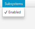
Of course, the approach shown above separates out the definition of the CheckMenuItem from the Menu, but this needn't be so.
To ascertain the current state of the CheckMenuItem, you should refer to the
selected boolean. An example use case may be the following example:
final checkMenuItem = new CheckMenuItem("Show Widget");
subsystem1.setOnAction(e -> System.out.println("Show the widget!"));
private final BooleanProperty widgetShowing();
public final boolean isWidgetShowing() { return widgetShowing.get(); )
public final void setWidgetShowing(boolean value) {
    widgetShowingProperty().set(value);
}
public final BooleanProperty widgetShowingProperty() {
    if (widgetShowing == null) {
        widgetShowing = new SimpleBooleanProperty(this, "widgetShowing", true);
    }
    return widgetShowing;
}

widgetShowing.bind(checkMenuItem.selected);
Typically a CheckMenuItem will be rendered such that, when selected, it shows a check (or tick) mark in the area normally reserved for the MenuItem graphic. Of course, this will vary depending on the skin and styling specified.
- Since:
- JavaFX 2.0
- See Also:
-
Property Summary
PropertiesProperties declared in class javafx.scene.control.MenuItem
accelerator, disable, graphic, id, mnemonicParsing, onAction, onMenuValidation, parentMenu, parentPopup, style, text, visible -
Field Summary
Fields declared in class javafx.scene.control.MenuItem
MENU_VALIDATION_EVENT -
Constructor Summary
ConstructorsConstructorDescriptionCreates an emptyCheckMenuItem.CheckMenuItem(String text) Constructs a CheckMenuItem and sets the display text with the specified text.CheckMenuItem(String text, Node graphic) Constructs a CheckMenuItem and sets the display text with the specified text and sets the graphicNodeto the given node. -
Method Summary
Modifier and TypeMethodDescriptionfinal booleanGets the value of theselectedproperty.final BooleanPropertyRepresents the current state of this CheckMenuItem.final voidsetSelected(boolean value) Sets the value of theselectedproperty.Methods declared in class javafx.scene.control.MenuItem
acceleratorProperty, addEventHandler, buildEventDispatchChain, disableProperty, fire, getAccelerator, getCssMetaData, getGraphic, getId, getOnAction, getOnMenuValidation, getParentMenu, getParentPopup, getProperties, getPseudoClassStates, getStyle, getStyleableParent, getStyleClass, getText, getTypeSelector, getUserData, graphicProperty, idProperty, isDisable, isMnemonicParsing, isVisible, mnemonicParsingProperty, onActionProperty, onMenuValidationProperty, parentMenuProperty, parentPopupProperty, removeEventHandler, setAccelerator, setDisable, setGraphic, setId, setMnemonicParsing, setOnAction, setOnMenuValidation, setParentMenu, setParentPopup, setStyle, setText, setUserData, setVisible, styleProperty, textProperty, visiblePropertyMethods declared in class java.lang.Object
clone, equals, finalize, getClass, hashCode, notify, notifyAll, toString, wait, wait, waitMethods declared in interface javafx.css.Styleable
getStyleableNode
-
Property Details
-
selected
Represents the current state of this CheckMenuItem. Bind to this to be informed whenever the user interacts with the CheckMenuItem (and causes the selected state to be toggled).- Default value:
- false
- See Also:
-
-
Constructor Details
-
CheckMenuItem
public CheckMenuItem()Creates an emptyCheckMenuItem. -
CheckMenuItem
Constructs a CheckMenuItem and sets the display text with the specified text.- Parameters:
text- the display text
-
CheckMenuItem
Constructs a CheckMenuItem and sets the display text with the specified text and sets the graphicNodeto the given node.- Parameters:
text- the display textgraphic- the graphic Node
-
-
Method Details
-
setSelected
public final void setSelected(boolean value) Sets the value of theselectedproperty.- Property description:
- Represents the current state of this CheckMenuItem. Bind to this to be informed whenever the user interacts with the CheckMenuItem (and causes the selected state to be toggled).
- Default value:
- false
- Parameters:
value- the value for theselectedproperty- See Also:
-
isSelected
public final boolean isSelected()Gets the value of theselectedproperty.- Property description:
- Represents the current state of this CheckMenuItem. Bind to this to be informed whenever the user interacts with the CheckMenuItem (and causes the selected state to be toggled).
- Default value:
- false
- Returns:
- the value of the
selectedproperty - See Also:
-
selectedProperty
Represents the current state of this CheckMenuItem. Bind to this to be informed whenever the user interacts with the CheckMenuItem (and causes the selected state to be toggled).- Default value:
- false
- Returns:
- the
selectedproperty - See Also:
-