java.lang.Object
javafx.scene.Node
javafx.scene.Parent
javafx.scene.layout.Region
javafx.scene.control.Control
javafx.scene.control.Labeled
javafx.scene.control.ButtonBase
javafx.scene.control.ToggleButton
- All Implemented Interfaces:
Styleable,EventTarget,Skinnable,Toggle
- Direct Known Subclasses:
RadioButton
public class ToggleButton
extends ButtonBase
implements Toggle
A 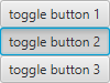
ToggleButton is a specialized control which has the ability to be
selected. Typically a ToggleButton is rendered similarly to a Button.
However, they are two different types of Controls. A Button is a "command"
button which invokes a function when clicked. A ToggleButton on the
other hand is simply a control with a Boolean indicating whether it has been
selected.
ToggleButton can also be placed in groups. By default, a
ToggleButton is not in a group. When in groups, only one
ToggleButton at a time within that group can be selected. To put two
ToggleButtons in the same group, simply assign them both the same
value for ToggleGroup.
Unlike RadioButtons, ToggleButtons in a
ToggleGroup do not attempt to force at least one selected
ToggleButton in the group. That is, if a ToggleButton is
selected, clicking on it will cause it to become unselected. With
RadioButton, clicking on the selected button in the group will have
no effect.
Example:
 ToggleButton tb1 = new ToggleButton("toggle button 1");
 ToggleButton tb2 = new ToggleButton("toggle button 2");
 ToggleButton tb3 = new ToggleButton("toggle button 3");
 ToggleGroup group = new ToggleGroup();
 tb1.setToggleGroup(group);
 tb2.setToggleGroup(group);
 tb3.setToggleGroup(group);
MnemonicParsing is enabled by default for ToggleButton.
- Since:
- JavaFX 2.0
-
Property Summary
Properties declared in class javafx.scene.control.ButtonBase
armed, onActionProperties declared in class javafx.scene.control.Labeled
alignment, contentDisplay, ellipsisString, font, graphic, graphicTextGap, labelPadding, lineSpacing, mnemonicParsing, textAlignment, textFill, textOverrun, text, underline, wrapTextProperties declared in class javafx.scene.control.Control
contextMenu, skin, tooltipProperties declared in class javafx.scene.layout.Region
background, border, cacheShape, centerShape, height, insets, maxHeight, maxWidth, minHeight, minWidth, opaqueInsets, padding, prefHeight, prefWidth, scaleShape, shape, snapToPixel, widthProperties declared in class javafx.scene.Parent
needsLayoutProperties declared in class javafx.scene.Node
accessibleHelp, accessibleRoleDescription, accessibleRole, accessibleText, blendMode, boundsInLocal, boundsInParent, cacheHint, cache, clip, cursor, depthTest, disabled, disable, effectiveNodeOrientation, effect, eventDispatcher, focused, focusTraversable, hover, id, inputMethodRequests, layoutBounds, layoutX, layoutY, localToParentTransform, localToSceneTransform, managed, mouseTransparent, nodeOrientation, onContextMenuRequested, onDragDetected, onDragDone, onDragDropped, onDragEntered, onDragExited, onDragOver, onInputMethodTextChanged, onKeyPressed, onKeyReleased, onKeyTyped, onMouseClicked, onMouseDragEntered, onMouseDragExited, onMouseDragged, onMouseDragOver, onMouseDragReleased, onMouseEntered, onMouseExited, onMouseMoved, onMousePressed, onMouseReleased, onRotate, onRotationFinished, onRotationStarted, onScrollFinished, onScroll, onScrollStarted, onSwipeDown, onSwipeLeft, onSwipeRight, onSwipeUp, onTouchMoved, onTouchPressed, onTouchReleased, onTouchStationary, onZoomFinished, onZoom, onZoomStarted, opacity, parent, pickOnBounds, pressed, rotate, rotationAxis, scaleX, scaleY, scaleZ, scene, style, translateX, translateY, translateZ, viewOrder, visibleProperties declared in interface javafx.scene.control.Toggle
selected, toggleGroup -
Field Summary
Fields declared in class javafx.scene.layout.Region
USE_COMPUTED_SIZE, USE_PREF_SIZEFields declared in class javafx.scene.Node
BASELINE_OFFSET_SAME_AS_HEIGHT -
Constructor Summary
Constructors Constructor Description ToggleButton()Creates a toggle button with an empty string for its label.ToggleButton(String text)Creates a toggle button with the specified text as its label.ToggleButton(String text, Node graphic)Creates a toggle button with the specified text and icon for its label. -
Method Summary
Modifier and Type Method Description protected PosgetInitialAlignment()Returns the initial alignment state of this control, for use by the JavaFX CSS engine to correctly set its initial value.Methods declared in class javafx.scene.control.ButtonBase
arm, armedProperty, disarm, fire, getOnAction, isArmed, onActionProperty, setOnActionMethods declared in class javafx.scene.control.Labeled
alignmentProperty, contentDisplayProperty, ellipsisStringProperty, fontProperty, getAlignment, getClassCssMetaData, getContentBias, getContentDisplay, getControlCssMetaData, getEllipsisString, getFont, getGraphic, getGraphicTextGap, getLabelPadding, getLineSpacing, getText, getTextAlignment, getTextFill, getTextOverrun, graphicProperty, graphicTextGapProperty, isMnemonicParsing, isUnderline, isWrapText, labelPaddingProperty, lineSpacingProperty, mnemonicParsingProperty, setAlignment, setContentDisplay, setEllipsisString, setFont, setGraphic, setGraphicTextGap, setLineSpacing, setMnemonicParsing, setText, setTextAlignment, setTextFill, setTextOverrun, setUnderline, setWrapText, textAlignmentProperty, textFillProperty, textOverrunProperty, textProperty, underlineProperty, wrapTextPropertyMethods declared in class javafx.scene.control.Control
computeMaxHeight, computeMaxWidth, computeMinHeight, computeMinWidth, contextMenuProperty, createDefaultSkin, getContextMenu, getCssMetaData, getInitialFocusTraversable, getTooltip, isResizable, setContextMenu, setTooltip, skinProperty, tooltipPropertyMethods declared in class javafx.scene.layout.Region
backgroundProperty, borderProperty, cacheShapeProperty, centerShapeProperty, computePrefHeight, computePrefWidth, getBackground, getBorder, getHeight, getInsets, getMaxHeight, getMaxWidth, getMinHeight, getMinWidth, getOpaqueInsets, getPadding, getPrefHeight, getPrefWidth, getShape, getUserAgentStylesheet, getWidth, heightProperty, insetsProperty, isCacheShape, isCenterShape, isScaleShape, isSnapToPixel, layoutInArea, layoutInArea, layoutInArea, layoutInArea, maxHeight, maxHeightProperty, maxWidth, maxWidthProperty, minHeight, minHeightProperty, minWidth, minWidthProperty, opaqueInsetsProperty, paddingProperty, positionInArea, positionInArea, prefHeight, prefHeightProperty, prefWidth, prefWidthProperty, resize, scaleShapeProperty, setBackground, setBorder, setCacheShape, setCenterShape, setHeight, setMaxHeight, setMaxSize, setMaxWidth, setMinHeight, setMinSize, setMinWidth, setOpaqueInsets, setPadding, setPrefHeight, setPrefSize, setPrefWidth, setScaleShape, setShape, setSnapToPixel, setWidth, shapeProperty, snappedBottomInset, snappedLeftInset, snappedRightInset, snappedTopInset, snapPosition, snapPositionX, snapPositionY, snapSize, snapSizeX, snapSizeY, snapSpace, snapSpaceX, snapSpaceY, snapToPixelProperty, widthPropertyMethods declared in class javafx.scene.Parent
getBaselineOffset, getChildren, getChildrenUnmodifiable, getManagedChildren, getStylesheets, isNeedsLayout, layout, layoutChildren, needsLayoutProperty, requestLayout, requestParentLayout, setNeedsLayout, updateBoundsMethods declared in class javafx.scene.Node
accessibleHelpProperty, accessibleRoleDescriptionProperty, accessibleRoleProperty, accessibleTextProperty, addEventFilter, addEventHandler, applyCss, autosize, blendModeProperty, boundsInLocalProperty, boundsInParentProperty, buildEventDispatchChain, cacheHintProperty, cacheProperty, clipProperty, computeAreaInScreen, contains, contains, cursorProperty, depthTestProperty, disabledProperty, disableProperty, effectiveNodeOrientationProperty, effectProperty, eventDispatcherProperty, executeAccessibleAction, fireEvent, focusedProperty, focusTraversableProperty, getAccessibleHelp, getAccessibleRole, getAccessibleRoleDescription, getAccessibleText, getBlendMode, getBoundsInLocal, getBoundsInParent, getCacheHint, getClip, getCursor, getDepthTest, getEffect, getEffectiveNodeOrientation, getEventDispatcher, getId, getInitialCursor, getInputMethodRequests, getLayoutBounds, getLayoutX, getLayoutY, getLocalToParentTransform, getLocalToSceneTransform, getNodeOrientation, getOnContextMenuRequested, getOnDragDetected, getOnDragDone, getOnDragDropped, getOnDragEntered, getOnDragExited, getOnDragOver, getOnInputMethodTextChanged, getOnKeyPressed, getOnKeyReleased, getOnKeyTyped, getOnMouseClicked, getOnMouseDragEntered, getOnMouseDragExited, getOnMouseDragged, getOnMouseDragOver, getOnMouseDragReleased, getOnMouseEntered, getOnMouseExited, getOnMouseMoved, getOnMousePressed, getOnMouseReleased, getOnRotate, getOnRotationFinished, getOnRotationStarted, getOnScroll, getOnScrollFinished, getOnScrollStarted, getOnSwipeDown, getOnSwipeLeft, getOnSwipeRight, getOnSwipeUp, getOnTouchMoved, getOnTouchPressed, getOnTouchReleased, getOnTouchStationary, getOnZoom, getOnZoomFinished, getOnZoomStarted, getOpacity, getParent, getProperties, getPseudoClassStates, getRotate, getRotationAxis, getScaleX, getScaleY, getScaleZ, getScene, getStyle, getStyleableParent, getTransforms, getTranslateX, getTranslateY, getTranslateZ, getTypeSelector, getUserData, getViewOrder, hasProperties, hoverProperty, idProperty, inputMethodRequestsProperty, intersects, intersects, isCache, isDisable, isDisabled, isFocused, isFocusTraversable, isHover, isManaged, isMouseTransparent, isPickOnBounds, isPressed, isVisible, layoutBoundsProperty, layoutXProperty, layoutYProperty, localToParent, localToParent, localToParent, localToParent, localToParent, localToParentTransformProperty, localToScene, localToScene, localToScene, localToScene, localToScene, localToScene, localToScene, localToScene, localToScene, localToScene, localToSceneTransformProperty, localToScreen, localToScreen, localToScreen, localToScreen, localToScreen, lookup, lookupAll, managedProperty, mouseTransparentProperty, nodeOrientationProperty, notifyAccessibleAttributeChanged, onContextMenuRequestedProperty, onDragDetectedProperty, onDragDoneProperty, onDragDroppedProperty, onDragEnteredProperty, onDragExitedProperty, onDragOverProperty, onInputMethodTextChangedProperty, onKeyPressedProperty, onKeyReleasedProperty, onKeyTypedProperty, onMouseClickedProperty, onMouseDragEnteredProperty, onMouseDragExitedProperty, onMouseDraggedProperty, onMouseDragOverProperty, onMouseDragReleasedProperty, onMouseEnteredProperty, onMouseExitedProperty, onMouseMovedProperty, onMousePressedProperty, onMouseReleasedProperty, onRotateProperty, onRotationFinishedProperty, onRotationStartedProperty, onScrollFinishedProperty, onScrollProperty, onScrollStartedProperty, onSwipeDownProperty, onSwipeLeftProperty, onSwipeRightProperty, onSwipeUpProperty, onTouchMovedProperty, onTouchPressedProperty, onTouchReleasedProperty, onTouchStationaryProperty, onZoomFinishedProperty, onZoomProperty, onZoomStartedProperty, opacityProperty, parentProperty, parentToLocal, parentToLocal, parentToLocal, parentToLocal, parentToLocal, pickOnBoundsProperty, pressedProperty, pseudoClassStateChanged, queryAccessibleAttribute, relocate, removeEventFilter, removeEventHandler, requestFocus, resizeRelocate, rotateProperty, rotationAxisProperty, scaleXProperty, scaleYProperty, scaleZProperty, sceneProperty, sceneToLocal, sceneToLocal, sceneToLocal, sceneToLocal, sceneToLocal, sceneToLocal, sceneToLocal, sceneToLocal, screenToLocal, screenToLocal, screenToLocal, setAccessibleHelp, setAccessibleRole, setAccessibleRoleDescription, setAccessibleText, setBlendMode, setCache, setCacheHint, setClip, setCursor, setDepthTest, setDisable, setDisabled, setEffect, setEventDispatcher, setEventHandler, setFocused, setFocusTraversable, setHover, setId, setInputMethodRequests, setLayoutX, setLayoutY, setManaged, setMouseTransparent, setNodeOrientation, setOnContextMenuRequested, setOnDragDetected, setOnDragDone, setOnDragDropped, setOnDragEntered, setOnDragExited, setOnDragOver, setOnInputMethodTextChanged, setOnKeyPressed, setOnKeyReleased, setOnKeyTyped, setOnMouseClicked, setOnMouseDragEntered, setOnMouseDragExited, setOnMouseDragged, setOnMouseDragOver, setOnMouseDragReleased, setOnMouseEntered, setOnMouseExited, setOnMouseMoved, setOnMousePressed, setOnMouseReleased, setOnRotate, setOnRotationFinished, setOnRotationStarted, setOnScroll, setOnScrollFinished, setOnScrollStarted, setOnSwipeDown, setOnSwipeLeft, setOnSwipeRight, setOnSwipeUp, setOnTouchMoved, setOnTouchPressed, setOnTouchReleased, setOnTouchStationary, setOnZoom, setOnZoomFinished, setOnZoomStarted, setOpacity, setPickOnBounds, setPressed, setRotate, setRotationAxis, setScaleX, setScaleY, setScaleZ, setStyle, setTranslateX, setTranslateY, setTranslateZ, setUserData, setViewOrder, setVisible, snapshot, snapshot, startDragAndDrop, startFullDrag, styleProperty, toBack, toFront, toString, translateXProperty, translateYProperty, translateZProperty, usesMirroring, viewOrderProperty, visiblePropertyMethods declared in class java.lang.Object
clone, equals, finalize, getClass, hashCode, notify, notifyAll, wait, wait, waitMethods declared in interface javafx.css.Styleable
getStyleableNode, getStyleClassMethods declared in interface javafx.scene.control.Toggle
getProperties, getToggleGroup, getUserData, isSelected, selectedProperty, setSelected, setToggleGroup, setUserData, toggleGroupProperty
-
Constructor Details
-
ToggleButton
public ToggleButton()Creates a toggle button with an empty string for its label. -
ToggleButton
Creates a toggle button with the specified text as its label.- Parameters:
text- A text string for its label.
-
ToggleButton
Creates a toggle button with the specified text and icon for its label.- Parameters:
text- A text string for its label.graphic- the icon for its label.
-
-
Method Details
-
getInitialAlignment
Returns the initial alignment state of this control, for use by the JavaFX CSS engine to correctly set its initial value. This method is overridden to use Pos.CENTER initially.- Overrides:
getInitialAlignmentin classLabeled- Returns:
- the initial alignment state of this control
- Since:
- 9
-