- Type Parameters:
T- The type of the value that has been selected or otherwise entered in to this ComboBox
- All Implemented Interfaces:
Styleable,EventTarget,Skinnable
public class ComboBox<T>
extends ComboBoxBase<T>
ComboBoxBase abstract class for the most common
form of ComboBox, where a popup list is shown to users providing them with
a choice that they may select from. For more information around the general
concepts and API of ComboBox, refer to the ComboBoxBase class
documentation.
On top of ComboBoxBase, the ComboBox class introduces additional API. Most
importantly, it adds an items property that works in
much the same way as the ListView items
property. In other words, it is the content of the items list that is displayed
to users when they click on the ComboBox button.
The ComboBox exposes the ComboBoxBase.valueProperty() from
ComboBoxBase, but there are some important points
of the value property that need to be understood in relation to ComboBox.
These include:
- The value property is not constrained to items contained within the items list - it can be anything as long as it is a valid value of type T.
- If the value property is set to a non-null object, and subsequently the items list is cleared, the value property is not nulled out.
- Clearing the
selectionin the selection model does not null the value property - it remains the same as before. - It is valid for the selection model to have a selection set to a given
index even if there is no items in the list (or less items in the list than
the given index). Once the items list is further populated, such that the
list contains enough items to have an item in the given index, both the
selection model
SelectionModel.selectedItemProperty()and value property will be updated to have this value. This is inconsistent with other controls that use a selection model, but done intentionally for ComboBox.
By default, when the popup list is showing, the maximum number of rows
visible is 10, but this can be changed by modifying the
visibleRowCount property. If the number of
items in the ComboBox is less than the value of visibleRowCount,
then the items size will be used instead so that the popup list is not
exceedingly long.
As with ListView, it is possible to modify the
selection model that is used,
although this is likely to be rarely changed. This is because the ComboBox
enforces the need for a SingleSelectionModel
instance, and it is not likely that there is much need for alternate
implementations. Nonetheless, the option is there should use cases be found
for switching the selection model.
As the ComboBox internally renders content with a ListView, API exists in
the ComboBox class to allow for a custom cell factory to be set. For more
information on cell factories, refer to the Cell and ListCell
classes. It is important to note that if a cell factory is set on a ComboBox,
cells will only be used in the ListView that shows when the ComboBox is
clicked. If you also want to customize the rendering of the 'button' area
of the ComboBox, you can set a custom ListCell instance in the
button cell property. One way of doing this
is with the following code (note the use of setButtonCell:
 Callback<ListView<String>, ListCell<String>> cellFactory = ...;
 ComboBox comboBox = new ComboBox();
 comboBox.setItems(items);
 comboBox.setButtonCell(cellFactory.call(null));
 comboBox.setCellFactory(cellFactory);
Because a ComboBox can be editable, and the
default means of allowing user input is via a TextField, a
string converter property is provided to allow
for developers to specify how to translate a users string into an object of
type T, such that the value property may contain it.
By default the converter simply returns the String input as the user typed it,
which therefore assumes that the type of the editable ComboBox is String. If
a different type is specified and the ComboBox is to be editable, it is
necessary to specify a custom StringConverter.
A warning about inserting Nodes into the ComboBox items list
ComboBox allows for the items list to contain elements of any type, includingNode instances. Putting nodes into
the items list is strongly not recommended. This is because
the default cell factory simply inserts Node
items directly into the cell, including in the ComboBox 'button' area too.
Because the scenegraph only allows for Nodes to be in one place at a time,
this means that when an item is selected it becomes removed from the ComboBox
list, and becomes visible in the button area. When selection changes the
previously selected item returns to the list and the new selection is removed.
The recommended approach, rather than inserting Node instances into the
items list, is to put the relevant information into the ComboBox, and then
provide a custom cell factory. For example,
rather than use the following code:
 ComboBox<Rectangle> cmb = new ComboBox<>();
 cmb.getItems().addAll(
     new Rectangle(10, 10, Color.RED),
     new Rectangle(10, 10, Color.GREEN),
     new Rectangle(10, 10, Color.BLUE));}
You should do the following:
 ComboBox<Color> cmb = new ComboBox<>();
 cmb.getItems().addAll(
     Color.RED,
     Color.GREEN,
     Color.BLUE);

 cmb.setCellFactory(p -> {
     return new ListCell<>() {
         private final Rectangle rectangle;
         {
             setContentDisplay(ContentDisplay.GRAPHIC_ONLY);
             rectangle = new Rectangle(10, 10);
         }

         @Override protected void updateItem(Color item, boolean empty) {
             super.updateItem(item, empty);

             if (item == null || empty) {
                 setGraphic(null);
             } else {
                 rectangle.setFill(item);
                 setGraphic(rectangle);
             }
         }
     };
 });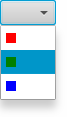
Admittedly the above approach is far more verbose, but it offers the required functionality without encountering the scenegraph constraints.
- Since:
- JavaFX 2.1
- See Also:
ComboBoxBase,Cell,ListCell,StringConverter
-
Property Summary
Properties Type Property Description ObjectProperty<ListCell<T>>buttonCellThe button cell is used to render what is shown in the ComboBox 'button' area.ObjectProperty<Callback<ListView<T>,ListCell<T>>>cellFactoryProviding a custom cell factory allows for complete customization of the rendering of items in the ComboBox.ObjectProperty<StringConverter<T>>converterReadOnlyObjectProperty<TextField>editorThe editor for the ComboBox.ObjectProperty<ObservableList<T>>itemsThe list of items to show within the ComboBox popup.ObjectProperty<Node>placeholderThis Node is shown to the user when the ComboBox has no content to show.ObjectProperty<SingleSelectionModel<T>>selectionModelThe selection model for the ComboBox.IntegerPropertyvisibleRowCountThe maximum number of rows to be visible in the ComboBox popup when it is showing.Properties inherited from class javafx.scene.control.ComboBoxBase
armed, editable, onAction, onHidden, onHiding, onShowing, onShown, promptText, showing, valueProperties inherited from class javafx.scene.layout.Region
background, border, cacheShape, centerShape, height, insets, maxHeight, maxWidth, minHeight, minWidth, opaqueInsets, padding, prefHeight, prefWidth, scaleShape, shape, snapToPixel, widthProperties inherited from class javafx.scene.Node
accessibleHelp, accessibleRoleDescription, accessibleRole, accessibleText, blendMode, boundsInLocal, boundsInParent, cacheHint, cache, clip, cursor, depthTest, disabled, disable, effectiveNodeOrientation, effect, eventDispatcher, focused, focusTraversable, hover, id, inputMethodRequests, layoutBounds, layoutX, layoutY, localToParentTransform, localToSceneTransform, managed, mouseTransparent, nodeOrientation, onContextMenuRequested, onDragDetected, onDragDone, onDragDropped, onDragEntered, onDragExited, onDragOver, onInputMethodTextChanged, onKeyPressed, onKeyReleased, onKeyTyped, onMouseClicked, onMouseDragEntered, onMouseDragExited, onMouseDragged, onMouseDragOver, onMouseDragReleased, onMouseEntered, onMouseExited, onMouseMoved, onMousePressed, onMouseReleased, onRotate, onRotationFinished, onRotationStarted, onScrollFinished, onScroll, onScrollStarted, onSwipeDown, onSwipeLeft, onSwipeRight, onSwipeUp, onTouchMoved, onTouchPressed, onTouchReleased, onTouchStationary, onZoomFinished, onZoom, onZoomStarted, opacity, parent, pickOnBounds, pressed, rotate, rotationAxis, scaleX, scaleY, scaleZ, scene, style, translateX, translateY, translateZ, viewOrder, visible -
Field Summary
Fields inherited from class javafx.scene.control.ComboBoxBase
ON_HIDDEN, ON_HIDING, ON_SHOWING, ON_SHOWN -
Constructor Summary
Constructors Constructor Description ComboBox()Creates a default ComboBox instance with an emptyitemslist and defaultselection model.ComboBox(ObservableList<T> items)Creates a default ComboBox instance with the provided items list and a defaultselection model. -
Method Summary
Modifier and Type Method Description ObjectProperty<ListCell<T>>buttonCellProperty()The button cell is used to render what is shown in the ComboBox 'button' area.voidcancelEdit()ObjectProperty<Callback<ListView<T>,ListCell<T>>>cellFactoryProperty()Providing a custom cell factory allows for complete customization of the rendering of items in the ComboBox.voidcommitValue()ObjectProperty<StringConverter<T>>converterProperty()protected Skin<?>createDefaultSkin()Create a new instance of the default skin for this control.ReadOnlyObjectProperty<TextField>editorProperty()The editor for the ComboBox.ListCell<T>getButtonCell()Gets the value of the property buttonCell.Callback<ListView<T>,ListCell<T>>getCellFactory()Gets the value of the property cellFactory.StringConverter<T>getConverter()Gets the value of the property converter.TextFieldgetEditor()Gets the value of the property editor.ObservableList<T>getItems()Gets the value of the property items.NodegetPlaceholder()Gets the value of the property placeholder.SingleSelectionModel<T>getSelectionModel()Gets the value of the property selectionModel.intgetVisibleRowCount()Gets the value of the property visibleRowCount.ObjectProperty<ObservableList<T>>itemsProperty()The list of items to show within the ComboBox popup.ObjectProperty<Node>placeholderProperty()This Node is shown to the user when the ComboBox has no content to show.ObjectqueryAccessibleAttribute(AccessibleAttribute attribute, Object... parameters)This method is called by the assistive technology to request the value for an attribute.ObjectProperty<SingleSelectionModel<T>>selectionModelProperty()The selection model for the ComboBox.voidsetButtonCell(ListCell<T> value)Sets the value of the property buttonCell.voidsetCellFactory(Callback<ListView<T>,ListCell<T>> value)Sets the value of the property cellFactory.voidsetConverter(StringConverter<T> value)Sets the value of the property converter.voidsetItems(ObservableList<T> value)Sets the value of the property items.voidsetPlaceholder(Node value)Sets the value of the property placeholder.voidsetSelectionModel(SingleSelectionModel<T> value)Sets the value of the property selectionModel.voidsetVisibleRowCount(int value)Sets the value of the property visibleRowCount.IntegerPropertyvisibleRowCountProperty()The maximum number of rows to be visible in the ComboBox popup when it is showing.Methods inherited from class javafx.scene.control.ComboBoxBase
arm, armedProperty, disarm, editableProperty, executeAccessibleAction, getOnAction, getOnHidden, getOnHiding, getOnShowing, getOnShown, getPromptText, getValue, hide, isArmed, isEditable, isShowing, onActionProperty, onHiddenProperty, onHidingProperty, onShowingProperty, onShownProperty, promptTextProperty, setEditable, setOnAction, setOnHidden, setOnHiding, setOnShowing, setOnShown, setPromptText, setValue, show, showingProperty, valuePropertyMethods inherited from class javafx.scene.control.Control
computeMaxHeight, computeMaxWidth, computeMinHeight, computeMinWidth, computePrefHeight, computePrefWidth, contextMenuProperty, getBaselineOffset, getClassCssMetaData, getContextMenu, getControlCssMetaData, getCssMetaData, getInitialFocusTraversable, getSkin, getTooltip, isResizable, layoutChildren, setContextMenu, setSkin, setTooltip, skinProperty, tooltipPropertyMethods inherited from class javafx.scene.layout.Region
backgroundProperty, borderProperty, cacheShapeProperty, centerShapeProperty, getBackground, getBorder, getHeight, getInsets, getMaxHeight, getMaxWidth, getMinHeight, getMinWidth, getOpaqueInsets, getPadding, getPrefHeight, getPrefWidth, getShape, getUserAgentStylesheet, getWidth, heightProperty, insetsProperty, isCacheShape, isCenterShape, isScaleShape, isSnapToPixel, layoutInArea, layoutInArea, layoutInArea, layoutInArea, maxHeight, maxHeightProperty, maxWidth, maxWidthProperty, minHeight, minHeightProperty, minWidth, minWidthProperty, opaqueInsetsProperty, paddingProperty, positionInArea, positionInArea, prefHeight, prefHeightProperty, prefWidth, prefWidthProperty, resize, scaleShapeProperty, setBackground, setBorder, setCacheShape, setCenterShape, setHeight, setMaxHeight, setMaxSize, setMaxWidth, setMinHeight, setMinSize, setMinWidth, setOpaqueInsets, setPadding, setPrefHeight, setPrefSize, setPrefWidth, setScaleShape, setShape, setSnapToPixel, setWidth, shapeProperty, snappedBottomInset, snappedLeftInset, snappedRightInset, snappedTopInset, snapPosition, snapPositionX, snapPositionY, snapSize, snapSizeX, snapSizeY, snapSpace, snapSpaceX, snapSpaceY, snapToPixelProperty, widthPropertyMethods inherited from class javafx.scene.Parent
getChildren, getChildrenUnmodifiable, getManagedChildren, getStylesheets, isNeedsLayout, layout, lookup, needsLayoutProperty, requestLayout, requestParentLayout, setNeedsLayout, updateBoundsMethods inherited from class javafx.scene.Node
accessibleHelpProperty, accessibleRoleDescriptionProperty, accessibleRoleProperty, accessibleTextProperty, addEventFilter, addEventHandler, applyCss, autosize, blendModeProperty, boundsInLocalProperty, boundsInParentProperty, buildEventDispatchChain, cacheHintProperty, cacheProperty, clipProperty, computeAreaInScreen, contains, contains, cursorProperty, depthTestProperty, disabledProperty, disableProperty, effectiveNodeOrientationProperty, effectProperty, eventDispatcherProperty, fireEvent, focusedProperty, focusTraversableProperty, getAccessibleHelp, getAccessibleRole, getAccessibleRoleDescription, getAccessibleText, getBlendMode, getBoundsInLocal, getBoundsInParent, getCacheHint, getClip, getContentBias, getCursor, getDepthTest, getEffect, getEffectiveNodeOrientation, getEventDispatcher, getId, getInitialCursor, getInputMethodRequests, getLayoutBounds, getLayoutX, getLayoutY, getLocalToParentTransform, getLocalToSceneTransform, getNodeOrientation, getOnContextMenuRequested, getOnDragDetected, getOnDragDone, getOnDragDropped, getOnDragEntered, getOnDragExited, getOnDragOver, getOnInputMethodTextChanged, getOnKeyPressed, getOnKeyReleased, getOnKeyTyped, getOnMouseClicked, getOnMouseDragEntered, getOnMouseDragExited, getOnMouseDragged, getOnMouseDragOver, getOnMouseDragReleased, getOnMouseEntered, getOnMouseExited, getOnMouseMoved, getOnMousePressed, getOnMouseReleased, getOnRotate, getOnRotationFinished, getOnRotationStarted, getOnScroll, getOnScrollFinished, getOnScrollStarted, getOnSwipeDown, getOnSwipeLeft, getOnSwipeRight, getOnSwipeUp, getOnTouchMoved, getOnTouchPressed, getOnTouchReleased, getOnTouchStationary, getOnZoom, getOnZoomFinished, getOnZoomStarted, getOpacity, getParent, getProperties, getPseudoClassStates, getRotate, getRotationAxis, getScaleX, getScaleY, getScaleZ, getScene, getStyle, getStyleableParent, getStyleClass, getTransforms, getTranslateX, getTranslateY, getTranslateZ, getTypeSelector, getUserData, getViewOrder, hasProperties, hoverProperty, idProperty, inputMethodRequestsProperty, intersects, intersects, isCache, isDisable, isDisabled, isFocused, isFocusTraversable, isHover, isManaged, isMouseTransparent, isPickOnBounds, isPressed, isVisible, layoutBoundsProperty, layoutXProperty, layoutYProperty, localToParent, localToParent, localToParent, localToParent, localToParent, localToParentTransformProperty, localToScene, localToScene, localToScene, localToScene, localToScene, localToScene, localToScene, localToScene, localToScene, localToScene, localToSceneTransformProperty, localToScreen, localToScreen, localToScreen, localToScreen, localToScreen, lookupAll, managedProperty, mouseTransparentProperty, nodeOrientationProperty, notifyAccessibleAttributeChanged, onContextMenuRequestedProperty, onDragDetectedProperty, onDragDoneProperty, onDragDroppedProperty, onDragEnteredProperty, onDragExitedProperty, onDragOverProperty, onInputMethodTextChangedProperty, onKeyPressedProperty, onKeyReleasedProperty, onKeyTypedProperty, onMouseClickedProperty, onMouseDragEnteredProperty, onMouseDragExitedProperty, onMouseDraggedProperty, onMouseDragOverProperty, onMouseDragReleasedProperty, onMouseEnteredProperty, onMouseExitedProperty, onMouseMovedProperty, onMousePressedProperty, onMouseReleasedProperty, onRotateProperty, onRotationFinishedProperty, onRotationStartedProperty, onScrollFinishedProperty, onScrollProperty, onScrollStartedProperty, onSwipeDownProperty, onSwipeLeftProperty, onSwipeRightProperty, onSwipeUpProperty, onTouchMovedProperty, onTouchPressedProperty, onTouchReleasedProperty, onTouchStationaryProperty, onZoomFinishedProperty, onZoomProperty, onZoomStartedProperty, opacityProperty, parentProperty, parentToLocal, parentToLocal, parentToLocal, parentToLocal, parentToLocal, pickOnBoundsProperty, pressedProperty, pseudoClassStateChanged, relocate, removeEventFilter, removeEventHandler, requestFocus, resizeRelocate, rotateProperty, rotationAxisProperty, scaleXProperty, scaleYProperty, scaleZProperty, sceneProperty, sceneToLocal, sceneToLocal, sceneToLocal, sceneToLocal, sceneToLocal, sceneToLocal, sceneToLocal, sceneToLocal, screenToLocal, screenToLocal, screenToLocal, setAccessibleHelp, setAccessibleRole, setAccessibleRoleDescription, setAccessibleText, setBlendMode, setCache, setCacheHint, setClip, setCursor, setDepthTest, setDisable, setDisabled, setEffect, setEventDispatcher, setEventHandler, setFocused, setFocusTraversable, setHover, setId, setInputMethodRequests, setLayoutX, setLayoutY, setManaged, setMouseTransparent, setNodeOrientation, setOnContextMenuRequested, setOnDragDetected, setOnDragDone, setOnDragDropped, setOnDragEntered, setOnDragExited, setOnDragOver, setOnInputMethodTextChanged, setOnKeyPressed, setOnKeyReleased, setOnKeyTyped, setOnMouseClicked, setOnMouseDragEntered, setOnMouseDragExited, setOnMouseDragged, setOnMouseDragOver, setOnMouseDragReleased, setOnMouseEntered, setOnMouseExited, setOnMouseMoved, setOnMousePressed, setOnMouseReleased, setOnRotate, setOnRotationFinished, setOnRotationStarted, setOnScroll, setOnScrollFinished, setOnScrollStarted, setOnSwipeDown, setOnSwipeLeft, setOnSwipeRight, setOnSwipeUp, setOnTouchMoved, setOnTouchPressed, setOnTouchReleased, setOnTouchStationary, setOnZoom, setOnZoomFinished, setOnZoomStarted, setOpacity, setPickOnBounds, setPressed, setRotate, setRotationAxis, setScaleX, setScaleY, setScaleZ, setStyle, setTranslateX, setTranslateY, setTranslateZ, setUserData, setViewOrder, setVisible, snapshot, snapshot, startDragAndDrop, startFullDrag, styleProperty, toBack, toFront, toString, translateXProperty, translateYProperty, translateZProperty, usesMirroring, viewOrderProperty, visibleProperty
-
Property Details
-
items
The list of items to show within the ComboBox popup.- See Also:
getItems(),setItems(ObservableList)
-
converter
Converts the user-typed input (when the ComboBox iseditable) to an object of type T, such that the input may be retrieved via thevalueproperty.- See Also:
getConverter(),setConverter(StringConverter)
-
cellFactory
Providing a custom cell factory allows for complete customization of the rendering of items in the ComboBox. Refer to theCelljavadoc for more information on cell factories.- See Also:
getCellFactory(),setCellFactory(Callback)
-
buttonCell
The button cell is used to render what is shown in the ComboBox 'button' area. If a cell is set here, it does not change the rendering of the ComboBox popup list - that rendering is controlled via thecell factoryAPI.- Since:
- JavaFX 2.2
- See Also:
getButtonCell(),setButtonCell(ListCell)
-
selectionModel
The selection model for the ComboBox. A ComboBox only supports single selection. -
visibleRowCount
The maximum number of rows to be visible in the ComboBox popup when it is showing. By default this value is 10, but this can be changed to increase or decrease the height of the popup.- See Also:
getVisibleRowCount(),setVisibleRowCount(int)
-
editor
The editor for the ComboBox. The editor is null if the ComboBox is noteditable.- Since:
- JavaFX 2.2
- See Also:
getEditor()
-
placeholder
This Node is shown to the user when the ComboBox has no content to show. The placeholder node is shown in the ComboBox popup area when the items list is null or empty.- Since:
- JavaFX 8.0
- See Also:
getPlaceholder(),setPlaceholder(Node)
-
-
Constructor Details
-
ComboBox
public ComboBox()Creates a default ComboBox instance with an emptyitemslist and defaultselection model. -
ComboBox
Creates a default ComboBox instance with the provided items list and a defaultselection model.- Parameters:
items- the list of items
-
-
Method Details
-
setItems
Sets the value of the property items.- Property description:
- The list of items to show within the ComboBox popup.
-
getItems
Gets the value of the property items.- Property description:
- The list of items to show within the ComboBox popup.
-
itemsProperty
The list of items to show within the ComboBox popup.- See Also:
getItems(),setItems(ObservableList)
-
converterProperty
Converts the user-typed input (when the ComboBox iseditable) to an object of type T, such that the input may be retrieved via thevalueproperty.- See Also:
getConverter(),setConverter(StringConverter)
-
setConverter
Sets the value of the property converter. -
getConverter
Gets the value of the property converter. -
setCellFactory
Sets the value of the property cellFactory.- Property description:
- Providing a custom cell factory allows for complete customization of the
rendering of items in the ComboBox. Refer to the
Celljavadoc for more information on cell factories.
-
getCellFactory
Gets the value of the property cellFactory.- Property description:
- Providing a custom cell factory allows for complete customization of the
rendering of items in the ComboBox. Refer to the
Celljavadoc for more information on cell factories.
-
cellFactoryProperty
Providing a custom cell factory allows for complete customization of the rendering of items in the ComboBox. Refer to theCelljavadoc for more information on cell factories.- See Also:
getCellFactory(),setCellFactory(Callback)
-
buttonCellProperty
The button cell is used to render what is shown in the ComboBox 'button' area. If a cell is set here, it does not change the rendering of the ComboBox popup list - that rendering is controlled via thecell factoryAPI.- Since:
- JavaFX 2.2
- See Also:
getButtonCell(),setButtonCell(ListCell)
-
setButtonCell
Sets the value of the property buttonCell.- Property description:
- The button cell is used to render what is shown in the ComboBox 'button'
area. If a cell is set here, it does not change the rendering of the
ComboBox popup list - that rendering is controlled via the
cell factoryAPI. - Since:
- JavaFX 2.2
-
getButtonCell
Gets the value of the property buttonCell.- Property description:
- The button cell is used to render what is shown in the ComboBox 'button'
area. If a cell is set here, it does not change the rendering of the
ComboBox popup list - that rendering is controlled via the
cell factoryAPI. - Since:
- JavaFX 2.2
-
setSelectionModel
Sets the value of the property selectionModel.- Property description:
- The selection model for the ComboBox. A ComboBox only supports single selection.
-
getSelectionModel
Gets the value of the property selectionModel.- Property description:
- The selection model for the ComboBox. A ComboBox only supports single selection.
-
selectionModelProperty
The selection model for the ComboBox. A ComboBox only supports single selection. -
setVisibleRowCount
public final void setVisibleRowCount(int value)Sets the value of the property visibleRowCount.- Property description:
- The maximum number of rows to be visible in the ComboBox popup when it is showing. By default this value is 10, but this can be changed to increase or decrease the height of the popup.
-
getVisibleRowCount
public final int getVisibleRowCount()Gets the value of the property visibleRowCount.- Property description:
- The maximum number of rows to be visible in the ComboBox popup when it is showing. By default this value is 10, but this can be changed to increase or decrease the height of the popup.
-
visibleRowCountProperty
The maximum number of rows to be visible in the ComboBox popup when it is showing. By default this value is 10, but this can be changed to increase or decrease the height of the popup.- See Also:
getVisibleRowCount(),setVisibleRowCount(int)
-
getEditor
Gets the value of the property editor.- Property description:
- The editor for the ComboBox. The editor is null if the ComboBox is not
editable. - Since:
- JavaFX 2.2
-
editorProperty
The editor for the ComboBox. The editor is null if the ComboBox is noteditable.- Since:
- JavaFX 2.2
- See Also:
getEditor()
-
placeholderProperty
This Node is shown to the user when the ComboBox has no content to show. The placeholder node is shown in the ComboBox popup area when the items list is null or empty.- Since:
- JavaFX 8.0
- See Also:
getPlaceholder(),setPlaceholder(Node)
-
setPlaceholder
Sets the value of the property placeholder.- Property description:
- This Node is shown to the user when the ComboBox has no content to show. The placeholder node is shown in the ComboBox popup area when the items list is null or empty.
- Since:
- JavaFX 8.0
-
getPlaceholder
Gets the value of the property placeholder.- Property description:
- This Node is shown to the user when the ComboBox has no content to show. The placeholder node is shown in the ComboBox popup area when the items list is null or empty.
- Since:
- JavaFX 8.0
-
createDefaultSkin
Create a new instance of the default skin for this control. This is called to create a skin for the control if no skin is provided via CSS-fx-skinor set explicitly in a sub-class withsetSkin(...).- Overrides:
createDefaultSkinin classControl- Returns:
- new instance of default skin for this control. If null then the control will have no skin unless one is provided by css.
-
commitValue
public final void commitValue()If the ComboBox iseditable, calling this method will attempt to commit the current text and convert it to avalue.- Since:
- 9
-
cancelEdit
public final void cancelEdit()If the ComboBox iseditable, calling this method will attempt to replace the editor text with the last committedvalue.- Since:
- 9
-
queryAccessibleAttribute
This method is called by the assistive technology to request the value for an attribute.This method is commonly overridden by subclasses to implement attributes that are required for a specific role.
If a particular attribute is not handled, the superclass implementation must be called.- Overrides:
queryAccessibleAttributein classComboBoxBase<T>- Parameters:
attribute- the requested attributeparameters- optional list of parameters- Returns:
- the value for the requested attribute
- See Also:
AccessibleAttribute
-